Showing posts with label COLOR. Show all posts
June 28, 2013

IF YOU COULD ONLY WEAR ONE COLOR FOR THE REST OF YOUR LIFE, WHICH COLOR WOULD YOU CHOOSE?

by , in
I know which one I would wear, without a doubt, but I won't tell you, just yet.

Choose the color you would choose to wear, if you had only one option, and let me know through a comment on this  post.

You can also check out the the meaning of colors, maybe it will give you a hint as to what color to choose or why.

I will let everyone know through a post on July 5th, what is my preference. The first person that posts the same color as me, will receive a personalized online Color Analysis worth USD200 and a copy of the 100 page E-book, "THE FIVE KEYS TO DRESSING WELL". If you are one of the first 50 people to guess the right color, you will also receive a copy of the E-Book "THE FIVE KEYS TO DRESSING WELL".


Give it a shot! Tell me which color you would choose to wear every day if you could only wear just one! You can only WIN!

Contest Rules
  • To enter the contest, leave a comment on this post.
  • Comments must be left on this post before July 5th, 2013, 12 p.m. US Eastern Time.
  • One comment per email address please.
  • Contest is open to entrants anywhere in the world.
  • The winner will be notified by e-mail within 48 hs of the closing date.
  • The first 50 participants that answer the same color chosen by me, will receive the E-book "THE 5 KEYS TO DRESSING WELL" by e-mail within 48 hours after the contest closing date.
  • Make sure you leave your e-mail in the comment box in order to receive your free copy of LookBookYou's E-book "THE 5 KEYS TO DRESSING WELL".


June 16, 2013

BRACELETS - The Easy to Wear Accessory

by , in

Bracelets

Bracelets are the easiest accessory to wear. 
Chunky, big and bold bracelets are everywhere. There are two basic things to consider when choosing a bracelet:

  • size of your wrist. 
    Follow the instructions below to measure it:
    • Measure it by wrapping it with you middle finger and your thumb, use the opposite hand of course! If you can barely touch the tip of your fingers, it means your wrist is large. If you can just touch, it is medium, and if you thumb overlaps your middle finger, you wrist size is small.
    •  A big wrist will look even bigger if you wear a thin bracelet. So use bracelets that are similar in scale to your own wrist. A thin wrist can look too fragile and thinner with a chunky big bracelet...so choose accordingly. 
      
  • The other factor to consider when choosing a bracelet is the overall color. Is it gold, or silver based? take a look at this post Is my skin warm or cool? for finding out what suits you better.


That's it! Just have fun! Bracelets are a great way to add a fun touch to any look. You can play with them and combine them in as many ways as you can think! They don't actually have to "match" anything else! And they are a great way to create a signature look. Imagine you have a beautiful piece that you love and wear all the time, no matter what...That is a signature you bring with you everywhere. People start to recognize your look and expect you to wear it every time. I particularly love to use either a ring or a bracelet as signature pieces

Take a look at some bracelet ideas from the windows of 5th Avenue stores in New York City 

 Bracelets! From the stores of New York City.

Rhinestones creating beautiful flower shapes, in neutral colors of silver and gold...
 Lots of colorful stones...turquoise is a classic...
 Geometrical shapes...
 Colorful enameled chunky bracelets...
 Gold chains in bold white...
 Rhinestones in bright colors...
 Bright pink and fuchsia...
 Flowers and rhinestones...
 Mix silver and gold bracelets and use them together...

 Black and Earth tones combined in this mix of four bracelets...
Lots of variety in the BRACELETS you see out there in the shops of New York City. You get to choose...Which one do you like most?
May 27, 2013

Is my Skin Warm or Cool?

by , in
Let's continue with part 5 of the Key #2 of The 5 Keys to Dressing Well

How do I know my skin's undertone?

This is the most important characteristic of color we should consider when choosing our personal colors.
Is my skin warm or cool? To understand more about color's  psychological and relative temperature take a look at The Basics of Colors to understand what makes colors seem warm or cool.

So, is your skin warm, cool or balanced?

One quick way to decide is to take a look at the inside skin of your forearm, and look at your veins there. Can you see them? Do they look blue, or purplish? or more like green?

  • Cool - bluish or purplish veins.
  • Warm - greenish veins
  • Balanced - somewhere in between, neither blue, nor green.

Why is this important? Because all colors have either a blue or a yellow component. Remember the three primary colors are Blue, Yellow and Red and from those, all other colors are created. Red being the "balanced" one when it comes to skin tone. Yes, I know it is hard to understand, because red is considered warm, but for our skin is considered a neutral.

If our skin has a warm undertone, we usually can wear well all colors with warm tones, therefore colors containing more yellow in their composition.


 If our skin has cool undertones, we can wear well all colors that have a mostly blue base.


When it comes to choosing the colors for our wardrobe, what we need to strive for is harmony, remember I talked about color Harmonies? Well, the same thing happens when we put ourselves in the equation. Go back to this post to remember about the basic color harmonies. 

We are the main component in the harmony we are to create with color, so it is important for us to determine, where am I in the color wheel?! I know it sounds strange! Hey! I am not the Incredible Hulk! neither am I Sesame's Street Yellow Bird....yes I know, but we DO have colors in us, and we need to find them...so that we can create the most beautiful harmonies possible! So in order to do that we start with our base....Are we closer to the blue? or closer to the yellow? or equally distant, as if we are red?

Having a Color Analysis done by an expert can be a valuable tool to help you improve your Personal Image.

This is another simple method you can use at home to determine for yourself whether your skin undertone is warm or cool.
  • Place a gold and a silver bracelet/watch across your forearm. If  you can see warmth in your skin using the gold and with the silver you can't, then you are probably warm.
  • Think about the type of jewellery you like to wear. Is it almost always gold? or you prefer silver? Gold is warm, Silver is cool. So if you like to use white gold, platinum, or silver accessories because they "suit" your skin and face better, then you most probably are Cool. If on the other hand all the jewellery you wear or accessories are mostly golden, then you are most probably Warm.

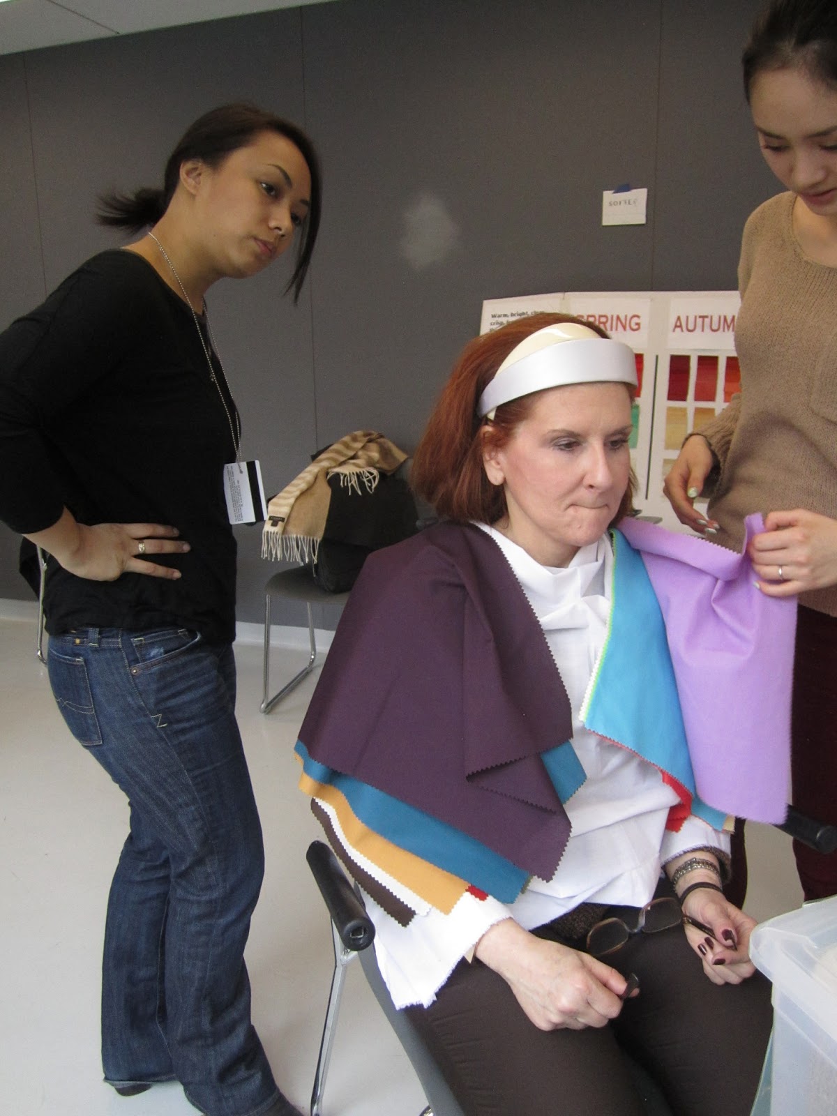
So when we have a professional Color Analysis done, what the we do, is first wear a grey or white robe, be in natural light or use a special lamp that imitates the sunlight we need, in case we are indoors and there are no windows, or the day is cloudy.


The we use two cards with different color swatches both blue and yellow based, to determine if the undertone is warm, cool or balanced. Once we have determined the skin's undertone we start the process of draping different colors to "see" which ones look good on you.

In general colors that are in harmony with your own personal coloring are those that:
  • bring out your best features.
  • make your eyes pop.
  • even out any imperfection you might have in your complexion.
  • they make you look rested and younger.
Colors that are not in harmony with your own personal coloring are those that:
  • make you look older
  • tired
  • cast shadows under your eyes, and chin
  • uneven your skin-tone
  • compete with you for visual attention.

Keep in mind that everybody can wear some "version" of almost every color, because all colors can have a blue or yellow base, or be neutral (universal colors).

I will tell you about the Seasonal Color Theory tomorrow. Stay tuned, because that is the system most widely used in the world to categorize personal coloring....

So tomorrow you will learn....Am I a Winter? A Summer? A Spring? or an Autumn?

Which one am I?! Is it "important" to know?

Stay tuned...


May 26, 2013

Colorful Nail Art

by , in

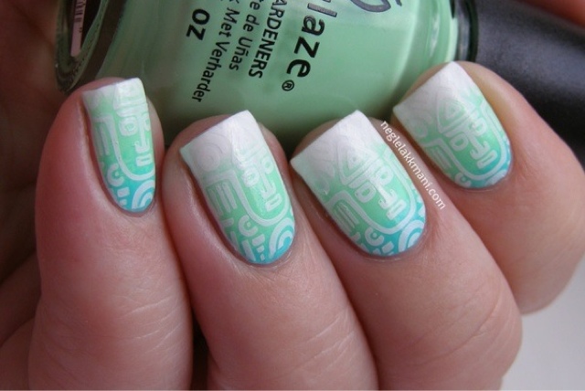
I'm stepping away from The 5 Keys to Dressing Well today, and since I have been talking a lot about color lately, I want to share with you one of my latest obsessions, you might know by now, as I have written another post about my own experiences with Nail Art! I just think it is such a nice way to experiment with color and with different styles. You can create almost anything and with the added bonus that mail enamel is not expensive and you can remove it in minutes in case it didn't turn out as planned!

What I think is great about it, is that you can wear so many colors and really brighten up your look. I don't recommend it for all ocassions though, but that is why it is so great that a little bit of polish remover and a few minutes later you can go back to a clean slate, although I must say some of those adhesives takes some time to remove.

But, why am I thinking about removing the polish? Even before I have started?!? I guess you just have to want to call attention when wearing nails like this, and maybe today is not the day for me! Doesn't it happen to you? I'm sure it does, some days you want to scream LOOK AT ME PEOPLE!!! And some days you just want to stay at home, relax, watch a nice movie and practically don't talk to anybody?! If that is the case for you today, then just take a look at this Nail Art I found online and you might just change your mind! Who would want to stay in with such great nails?!

Would you dare even try? Enjoy!


May 25, 2013

Personal Coloring - The Basics of Color

by , in
Key # 2 - Part 3 - of The 5 Keys to Dressing Well


Personal Coloring - The Basics of Color


Our bodies have a unique color pattern, we need to choose colors that enhance it.

Let's talk about hues: hues are the common names we use to refer to colors, such as: blue, green, red, yellow, purple, etc.

There are six basic hue families: the reds, the oranges, the yellows, the greens, the blues,  and the violets or (purples).

When we talk about colors we use names that are very descriptive, we may refer to food or animals to name them, such as peach, salmon, canary yellow, apple green, etc. This is important because when we just talk about colors and can't show them visually, we need to have tools that can help us and everyone picture the color in their minds. At the end of this post there is a list of color names for your reference.
  
Color also has temperature - We can categorize hues are either warm or cool. 
Psychologically we give colors temperature: so the reds, yellows and oranges,  are usually regarded as warm, they remind us of fire, the sun, the power of aggression.
The blues, violets and greens, remind us of cold splashes of water, shadows under trees, mountain tops, deep blue skies, these colors are often associated with distance, calm, tranquility, and coolness. 
Thus hues can either be warm or cool. The warm hues are more yellow. Cool hues are like the sky and water they recede in the background.

Primary colors - red yellow and blue.
There are other terms you should be familiar with, they are:
Value: it describes how light or dark a color is.
Chroma: it refers to the purity of a color. How clear or muted a color is.
Harmony: the way we combine certain colors.

Now let's go back to the temperature of colors, beacuse here lies a lot of the relevance we will give to them when choosing our own palette.

We said that the reds, oranges, and yellow are warm, and the blues, violets and greens are cool. That is just to begin with. That is the psychological association we give to color. But colors also have a relative temperature that depends on how it is mixed, let's see, for example if you look at the color wheel the red, if it is mixed with blue, it becomes Red-Violet, and has a cooler temperature, the same thing happens, with yellow when mixed with green, Yellow-Green.
This especially happens with greens that although they are considered cool, they are a mixture of both yellow (warm) and blue (cool). All oranges are warm, because they are made up of red and yellow (both warm). I believe orange is one of the most difficult colors to wear well.   But sometimes we can change its value, and make it work! 

Value

Let's continue with the orange, it can either be very dark or very light. This relative darkness or lightness is called value. We can add white to an orange pigment and make it lighter, thus changing its value, but what we can never do with orange is change its temperature. If we do it will no longer be orange. Usually when colors are light they appear "tinted" or whitish. We can also add black to orange to make it darker. It will appear shaded, deepened, and weighty. Usually when colors are darkened by adding black they are considered: serious, profound, mysterious.
There are other ways to lighten and darken colors, and also to mix them, but I am not going to go further into this, for now. It is not necessary for our purpose, and I don't want to complicate things.

Chroma

This is very important when it comes to choosing our wardrobe also. Colors can be clear, which means the pigment is very pure, or muted which means the color was combined with its complementary color or shaded with gray to soften it down. Clear colors are bright and vibrant and tend to reflect light. Muted colors appear misty, veiled, and de-intensified. Muted colors are gentle, soft, and can be also subtle.

Harmony

Harmony is the combination of hues, and we use it in clothing to achieve a certain look and style. 
Harmonies can be:
  • Monochromatic: only one color, use one hue (e.g. all blues, light blue top and navy blue pants)  Same hue is with different values. 
  • Triadic: the harmony created by hues that are equidistant from each other on the wheel (e.g. red/yellow/blue or green/orange/violet)
  • Analogous: two or three hues that appear side by side on the color wheel (e.g. reds/violets/blues)
  • Complementary: Two hues that appear opposite each other on the color wheel. (e.g. red/green, orange/blue, yellow/violet)  

Following is a list of common names for different colors: 
    Ivory - Champagne- Cappuccino - Toffee - Copper- Russet- Bronze - Gold - Tan - Olive - Chocolate - Beige - Walnut - Sable - Avocado - Olive - Fuchsia -  Herb - Forest Green - Cedar Green - Teal - Navy- Aqua - Patel Blue - Azure - Royal Blue - Periwinkle - Sapphire - Cool Turquoise - Jade - Blue-green - Emerald - Hunter green - Moss - Balsam - Spruce - Celery - Kelly green - Apple green - Lime - Citron  - Ginger - Tawny-  Plum - Eggplant - mauve - aubergine - butter-cup - Marigold - Tangerine - Peach - Poppy - Coral - Apricot - Salmon - Pumpkin - Brick - Wine - Burgundy - Merlot - Pastel pink - Cerise - Crimson - watermelon - Chinese red - True red - Indigo - Apricot - Smokey Coral - Cherry red - Stone - Pewter - Cocoa - Winter white - Off white - Pearl - Cream - Acorn 


    May 24, 2013

    What is the Color of the Season? Should we care?

    by , in

    Let's Continue with the Second Key to The 5 Keys to Dressing Well

    Color - Part 2

    What is the Color of the Season? Should I care?

    Business historian Regina Lee Blaszcyk says colors have been trending in and out of style since even before the French Revolution, at that time pastel colors were a big trend. Queen Victoria wore a mauve gown to her daughter’s wedding in 1858, and after that all the “proletariat” copied her look, as new chemical dyes allowed its massive production. The color became very popular, so much that the 1860’s came to be known as the “mauve decade”. Ms Blaszcyk says in her book “The Color Revolution” that “wearing purple then, showed you knew what was cool.”

    These days, fashion runs much faster.  Each year Pantone, polls fashion, interior and industrial designers and brands and finds out which are the colors they are working with for the next season. Then based on the surveys and polls, they also take into account the sales of color swatches and the opinion of color specialists, then a group of Pantone executives and clients makes a pick. Each fall and spring, Pantone, the leading authority on color, comes out with the following season’s color trends and announces the hot "Color of the Year" in early spring.


    Add caption

     Usually once Pantone massively  communicates the “Color of the Season”, the big brands have already started showcasing it on their product lines.

    Emerald Green being the Color of 2013


    These are the additional Colors for Fall 2013:


    A lot of smaller brands and designers with smaller productions are waiting for Pantone to launch the “Color of the Season”, as it is well known that consumers will be demanding products in that color tone. A good brand, and designer, will not wait for Pantone, but will be working with whatever color suits their client base. It is important to be in tune with the great majority and the color “authorities” but it is also fundamental to pay attention to what your own consumers are telling you. Check your sale statistics, run polls and talk to your consumers. It is important to know which will be the color of the season and it is fundamental to have variations of that color to offer to the public, as we will see later that not every color suits every skin tone.

    On a personal level, it is always good to base your wardrobe with "neutral" colors. And also add the "Universal Colors", these are the colors that beautify and compliment all kinds of human coloring.

    Universal Colors are the colors that work well with any hair color, eye color, skin color and undertone, and are flattering to all! These colors have a balance of warm and cool tones.

    This are the most popular universal colors: A great way to add color to your wardrobe is by incorporating these, as you cannot go wrong!
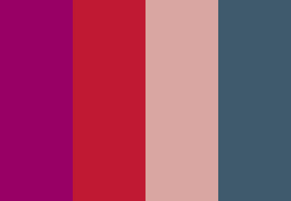
    • Eggplant – it’s a deep purple, deep enough to look almost like a black. It is considered a neutral like black, brown or navy.
    • Indian Teal – A combination of green and blue that is flattering to all. It brings out the richness of eye-color.
    • Mellow Rose – Somewhere in between a peach and a light pink. It is also considered a neutral.
    • True Red – It falls in between a cool cherry red and a warm tomato red.

      When we learn to use color wisely we can enhance our wardrobe and make it a part of our personal style.  Color can be used both visually and emotionally to help us feel good and look good. What we need to know now, is not just what colors bring about good emotion on us, but which colors flatter our features, hair and skin.
      It is not that difficult. There are many systems out there, that can “categorize” your coloring to recommend a palette of colors. I will teach you about them, and I will let you know what is the best way to simplify this assortment of tools, and what you can really trust.

      I will give you some of the tools you need to understand and pick the best colors for you.
      Until tomorrow…

      May 23, 2013

      What do Colors mean?

      by , in

      Let's start with Key # 2 to The 5 Keys to Dressing Well

      Complement your own Personal Coloring


      What is the first thing you remember about what someone wore for an event? It’s usually the color, isn’t it? Color is so powerful that its impression stays with us, long after the other characteristics of a look, are gone from our memory.
      We usually go for color first when shopping for a garment. Color is the essence of light, its varying wavelengths enable us to see the different colors of the spectrum. 
      Color is one of the tools we use to communicate not only who we are, but how we are feeling at the moment. When we favor one color over another, we are telling a story about not only who we are, but how we feel.

      Most of us, just intuit colors, our relationship with them is quite subconscious. We cannot put it into words, we just feel that we need to wear a certain color. Let’s try and understand what is behind our color choices, and see if we can be more conscious about them, so that next time if we are feeling low in energy and have a big day ahead of us, instead of going for plain black, or blue, we will choose to wear red shirt, and use the color to modify our emotional state for the better.

      Color can dramatically affect moods and emotions as well as influence certain physiological reactions. Interior designers and artists have long understood the feelings that certain colors evoke personally and culturally. “Colors like features follow the changes of emotions” Pablo Picasso.

      Culture is very important when it comes to our interpretation of colors and their social meaning. Each culture has its own set of traditions and history and thus the significance of color can vary greatly. I am going to talk about the meaning of color, in an emotional and visceral level, which is in some ways independent from culture, and applies to all. All “positive” , “negative” and “neutral” associations below:

      Red:  Excitement, passion, intensity, stimulation, creates very strong emotions and is an attention grabber, proven to cause blood pressure and heart rate to rise. Visceral, disturbing, defiant, aggressive.
      Orange:  Friendliness, vibrancy, energy, social, playfulness, attention drawing. Intrusive, common.

      Yellow:  Warm, alert, creative, cheery, optimistic, radiant, expansive.  Increases metabolism. Eccentric.
      Blue:  Is very popular and one of the basic neutral colors. Calm, soothing, peaceful, encourages trust, loyalty, lowers pulse rate and body temperature, and if used in interior spaces creates productivity. Cold, depressing, melancholic.
      Purple:  The color of wisdom, wealth, luxury, extravagance a royalty, exotic and rich. Color that symbolizes a spiritual connection. Esoteric, marginal.
      Green: The color of Nature, health, tranquility, creates a calming effect, relieves stress, and helps healing, soothes the nerves, comforting, consoling, increases oxygenation, openness and bonding. Common.  
      White:  Pure, clean, innocent, celestial, spiritual, gives us a sense of space, of limitless abundance, amplifies.  Sterile.
      Black:  Sophisticated, powerful, elegant, authoritative, confident, stable, firm, hard and secure. Empty, mourning.
      Brown: Dependable, steady, reliable, stable, grounded. Boring, Stingy.
      Pink: Sweet, gentle, tenderness, soft.  Effeminate, bland.
      Gray: Protective, safe, secure, passive. Negative, old. 
      These are just a few of the associations or emotional/psychological meaning we give to colors. Think about yours.
      •  Do you have a favorite color?
      • Check your closet: What is the color/s that are more prominent in your wardrobe?
      • Do you usually tend to choose the same color/s? Which are they?
      • Why do you choose those colors? What emotions do they evoke on you? Maybe they remind you of someone? Something?
      • Does your favorite color match your eye-color? Hair color?
      Take notes!
      May 12, 2013

      How to SIMPLIFY what to wear?

      by , in
      Spring Cluster

      Spring Cluster by lookbook-you

      This is an example of a SIMPLE "CLUSTER" 
      To make a cluster with what you already own in your closet just, pick: 
      • three bottom parts
      • five tops
      • two pairs of shoes: one flat, one high heels
      • one scarf or shall
      • one handbag
      • a couple of accessories, in this case I just picked a hairband, because I love hair accessories and I want to really simplify. But if what you want is to make very different looks, the best choice, is to incorporate totally different accessories with each look. 

      Do you have your wardrobe classified by clusters? Have you ever tried?
      May 02, 2013

      Are NEON colors still trending?

      by , in
      Are Neon Colors still trending?

      YES!

      Why is this trend that started almost two years ago, still so popular?


      What exactly makes neon colors, so appealing?


      Are Neon Colors the new classics? 
      I am betting that just like what happened with "animal prints" Neon colors are here to stay for a long while. So you better learn how to make the best of them!


      michael kors nyc
      Fluorescence is the
      emission of light by a substance that has absorbed light. It is a form of luminescence. It absorbs energy, stores and emits it, slowly and continuously. So it is a constant source of ENERGY! Wow! then that would explain why its used do much for sports wear! I wouldn't mind a little bit more energy when going for my morning runs!


      Neon colors or fluorescent colors, are playful, fun and very much 80's ....One of the reasons why everybody who is in their 30's either loves them, or hates them! Depending on childhood experiences :-)
      kate spade nyc

      Wearing neon colors instantly brightens you up, it adds lightness to any outfit, and communicates that you can be playful and fun.


      Manhattan girl
      Manhattan girl

      Just adding enough of this colors is key, you don't want to either seem too informal, unless you are a kindergarten teacher, or call too much attention (unless you are directing airplanes to their bays, or high traffic on a Monday morning in Manhattan) I wouldn't recommend you to wear this neon pink dress on the right, to the office. Although she is wearing black sleeves, black pantyhose and black boots. It is still too informal for business. If your field of work is informal, or you are just running errands, then you would look great, just like the lady on the left. She is wearing a pair of blue jeans, a neon pink cardigan and a neon mint green scarf, which combine beautifully. Needless to say if you are on the way to the beach neon is an ideal option!
      Zara New York City


      Armani Exchange New York City
      The easiest way to use Neon colors is to add them in small doses.  I went back to the little beautiful streets of Miami and then to Manhattan to find out how people are wearing this trend, and how stores and brands are styling it.


      Autumn or Spring, Winter or Summer, Neon colors can be worn ALL Seasons. Hats, necklaces, shoe laces, t-shirts, beach dresses, and all kinds of accessories are ideal pieces, also bags, backpacks, and items that you can add on and subtract easily from an outfit.


      La fosforescencia es el fenomeno en el cual ciertas sustancias tienen la propiedad de absorber ENERGIA y almacenarla, para emitirla posteriormente. La energía absorbida se libera lenta y continuamente.

       Vestir colores neon o fosforescentes es tener una fuente proveedora de energia continua! Sera por eso que se utilizan tanto estos colores para la ropa deportiva?!
      Madewell


      Son divertidos, brillantes, informales. Ademas, los colores fosforescentes son sinónimo de años 80. Una de las razones por las que las mujeres de más de 30, los aman u odian, dependiendo de sus experiencias en la infancia.
      Manhattan girl


      Los colores fluo, fosforescentes o neon, son ideales para usar como "accent pieces", aunque hoy en dia, podemos verlos en outfits completos, de pies a cabeza. 


      Este trend que comenzo hace poco mas de dos años, llego para quedarse. No me extranaria si no se convierte en un "clasico" como lo hicieron los "animal prints"
      Manhattan girl
      anthropologie new york city
      Los colores fluo se asocian con la diversión, la informalidad. Son colores dinámicos, y que llaman la atención instantáneamente. Es por eso que se ven mucho en la industria deportiva.

      Para incorporarlos a nuestro vestuario, la clave esta en usarlos en "dosis", pues no queremos que nos confundan con el señor de tráfico de aeronaves, ni con el policía de tránsito. 
      Manhattan girl
      Banana Republic New York City


      Decidí salir por las callecitas de Miami y de Nueva York para ver como estan usando estos colores fluo.


      Si todavia no usaron ningun color fosforescente esta temporada, les sugiero que se animen, empiecen con algún accesorio, o detalle.
      Miami street style

      El poder de los colores, es inmenso, no me cansare de repetirlo! y en el caso de los colores fosforescentes se cumple mas que nunca! Pura, pura, pura ENERGIA! quiero más!